Dashboard
Introduced in Version 12
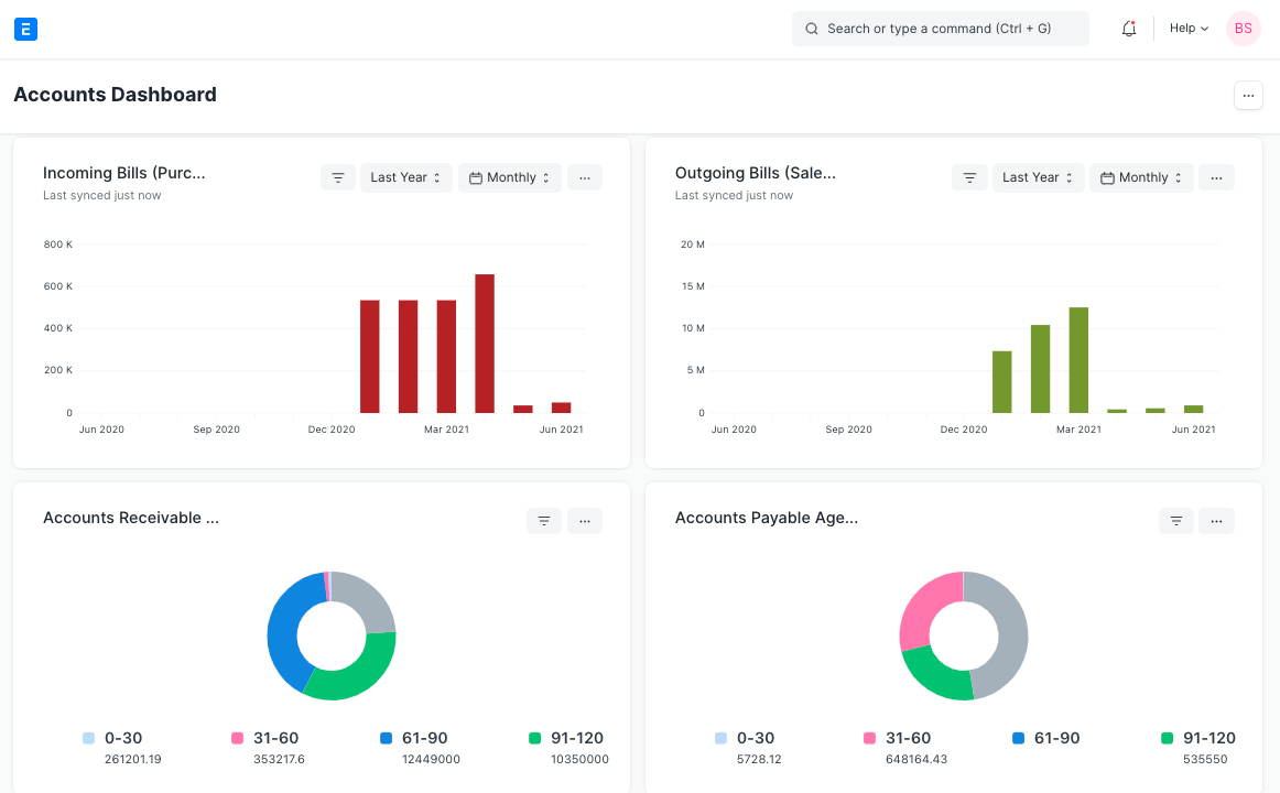
Dashboard provides an at-a-glance view of key performance indicators relevant to the business process.
Each Dashboard consists of one or more than one Dashboard Charts each of which are configured with a data source known as Dashboard Chart Source.
To access Dashboard, go to,
Home > Customization > Dashboards > Dashboard
1. How to Create a New Dashboard
- Go to Dashboards List and click on New.
- Enter the Module Name for which you would want to see the Dashboard.
- Enter the Dashboard Charts that you would want to be parameterized for this Dashboard.
- Save.
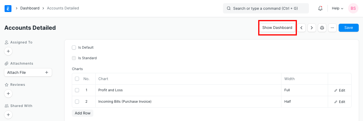
When you click on Show Dashboard, you will be able to see the Dashboard giving the graphic representation of your transactions.
2. Adding Charts to Dashboard
Add charts to this dashboard by either selecting existing Dashboard Chart or creating new ones.
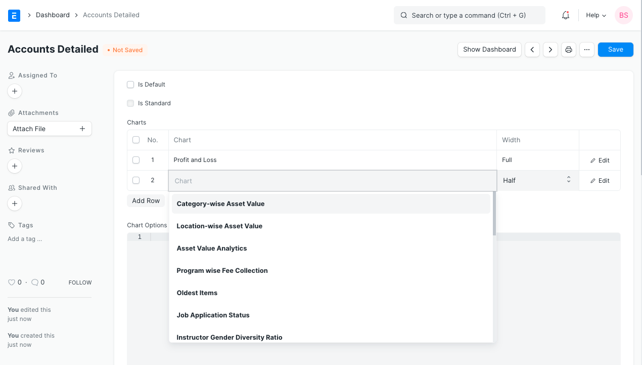
Save changes and click on Show Dashboard button to see the dashboard.
3. Creating a New Dashboard Chart
To create a new Dashboard Chart, go to
Home > Customizations > Dashboards > Dashboard Chart > New
Provide a name for the chart, this will show up in the dashboard as the chart label, select chart type as Custom and select a Dashboard Chart Source as the data source for this chart.
Note: New Dashboard Chart Source can only be created by the Administrator User in Developer Mode.
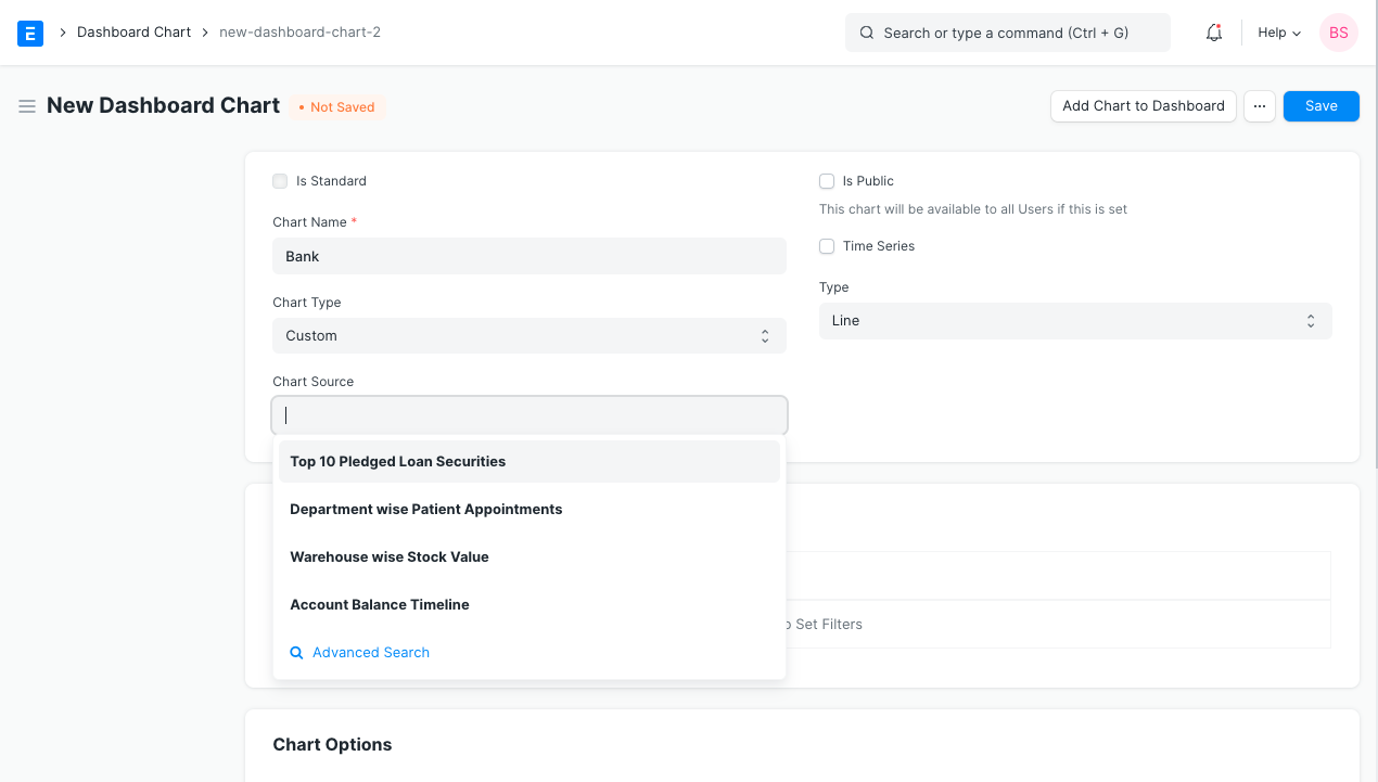
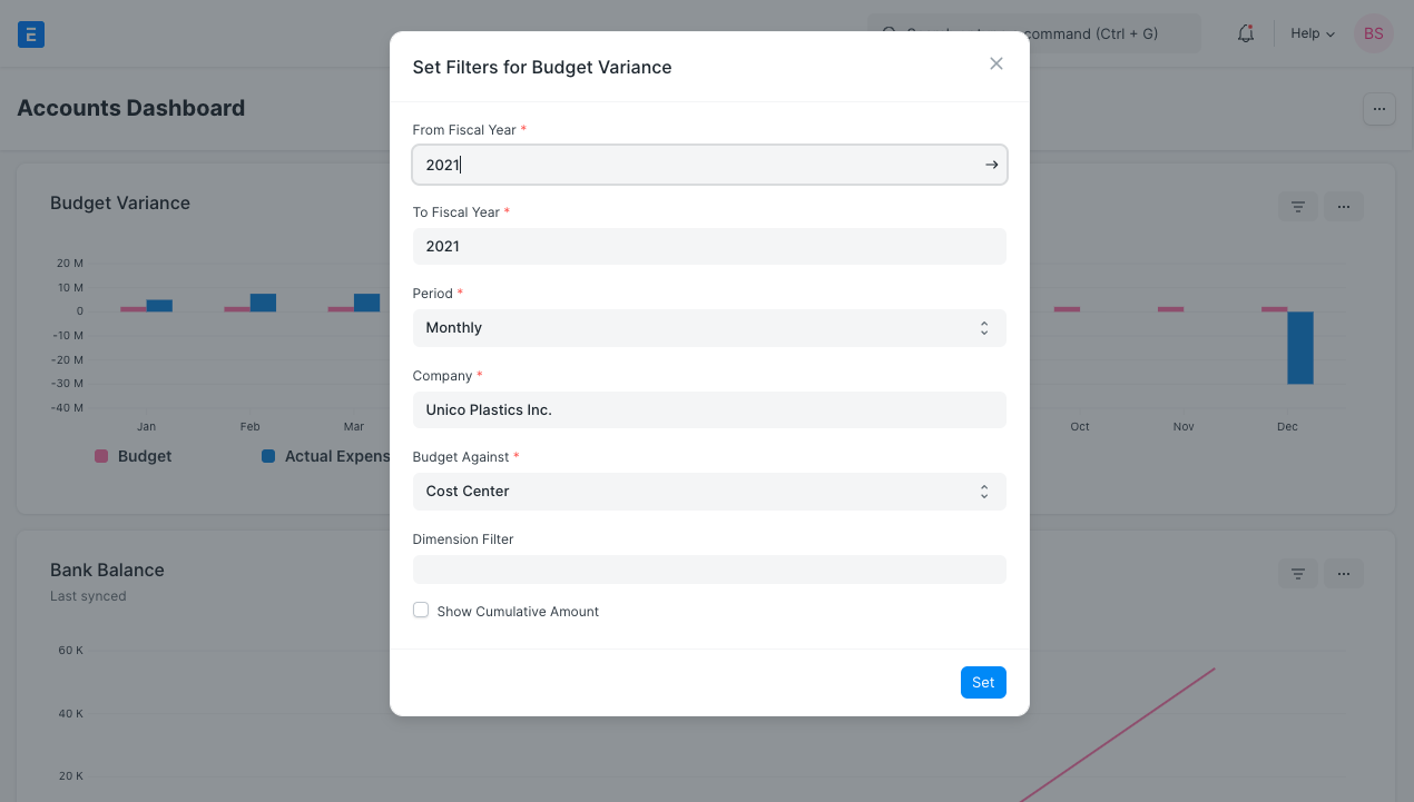
After setting the Chart Source field, the filters table will be shown.
Click the table to edit filters.
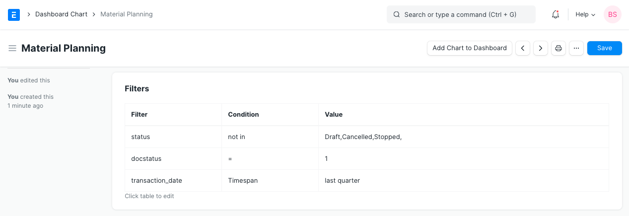
A modal will be shown to set filters. Click Set to set filters. 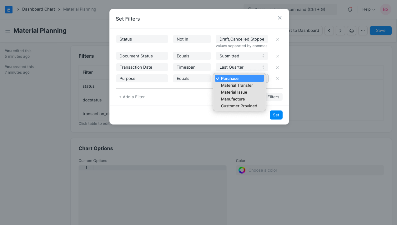
After setting Chart Source field, Filters table will be updated with selected filter values. 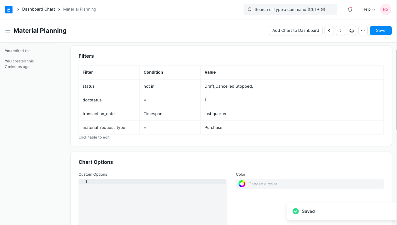
In the above example, we created a custom Dashboard Chart for which we already had a Dashboard Chart Source.
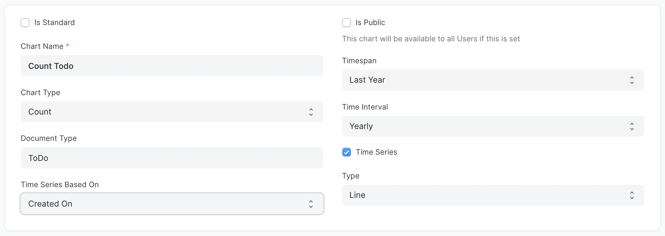
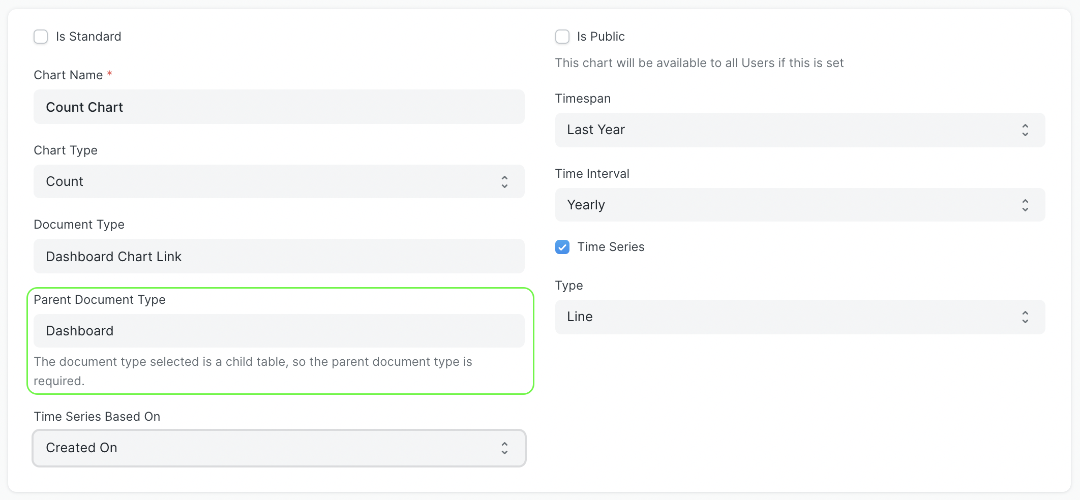
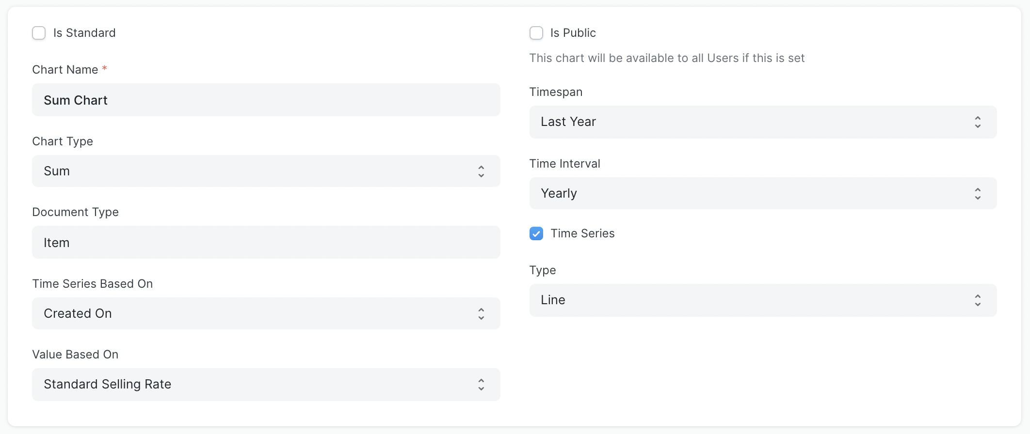
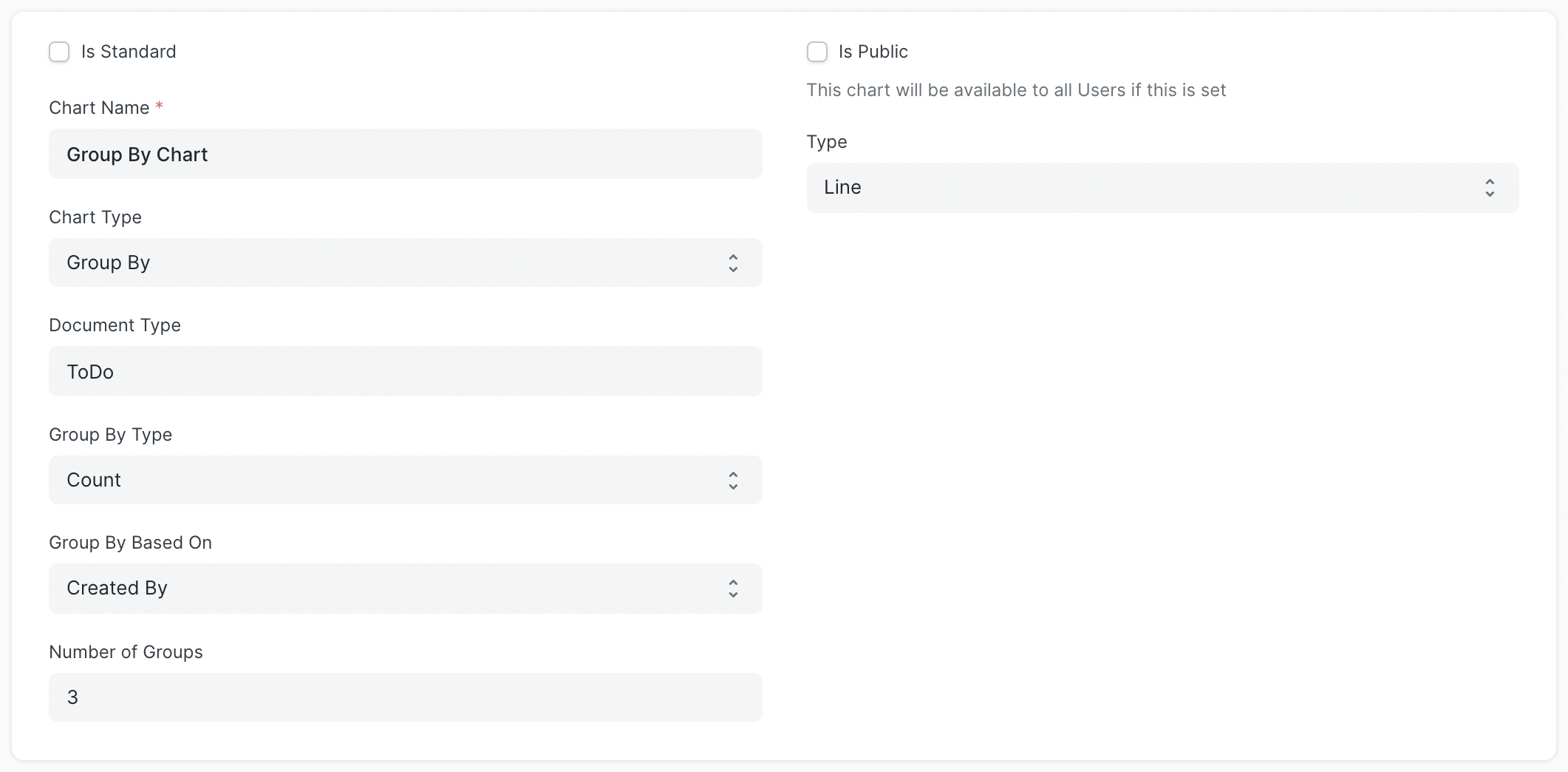
You can also create basic charts like Count/Sum/Average/Group By of ToDo based on creation/modified date by selecting Count/Sum/Average/Group By as Chart Type also you can use an existing report as a source in Report Name field to create a chart by selecting Report as Chart Type.
For Count, you need to select the Doctype for which you need the chart in the Document Type field and Based On Date field in Time Series Based On.
Note: If you select a child table doctype in Document Type you also have to select the parent doctype for that child table in Parent Document Type (this field will only be visible when you select child table doctype in Document Type field).
For Sum and Average you also have to select the Based On Value field in Value Based On.
For Group By you can select Group By Type as Count/Sum/Average, Group By Based On as Created By/Modified By, and Number of Groups.
4. Using Dashboards
Every chart will be shown according to the fields set in the corresponding Dashboard Chart. The result from the dashboard chart source is cached to avoid redundant queries. Since the chart data can be stale, each chart will also show the last synced time.
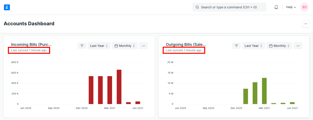
The filters used to generate the chart data can also be changed by clicking Set Filters. The chart will be refreshed automatically according to the recently set filters.
To get the most recent data each chart has to be refreshed forcefully by clicking Force Refresh button from the dropdown menu.